Ochre & Oak — Café Social Media Content & Mascot Design
Fictional Client Project · Food & Beverage / Café · 7-Day Social Media Content Series
Ochre & Oak is a minimal specialty coffee café built around a 'slow morning' feeling. This project covers a full 7-day Instagram content calendar — mixing single posts and carousels — anchored by a custom brand mascot designed to carry consistency across every format, from flat graphic cards to photography.
How the content measures up against the brief
Subjective self-assessment against brief requirements (1–10 scale)
The Brief
Ochre & Oak is a minimal specialty coffee café built around a 'slow morning' feeling — exposed wood, ceramic cups, natural light — aimed at young professionals, remote workers, and coffee enthusiasts aged 22–35. The brief called for a full 7-day content calendar mixing single posts and carousels, with a visual direction built on warm neutrals, editorial serif headlines, natural-light flat lays, and breathable, minimal-text layouts — the antithesis of a busy, discount-driven café feed.
The ask covered seven distinct days: a brand-intro post, a bean-to-cup carousel, a featured-drink post, a 'ways to enjoy your coffee' carousel, a moody interior quote card, a coffee-and-pastry pairing post, and a weekend call-to-action — each with its own format and visual job to do, but all needing to read as one brand.
The Challenge
A 7-day calendar is only as strong as its glue. Individual posts are easy; what's hard is making a discount-flat-lay, a process carousel, and a moody illustrated scene all feel like they came from the same café. Rather than relying purely on a fixed color palette to do that job, the project introduced a recurring mascot — a small, sleepy-eyed coffee cup character — that could appear consistently across every post regardless of format, mood, or medium.
The brand also leaned into a confident, saturated green-and-cream palette rather than a purely neutral one, using deep forest green as an anchor tone and a soft matcha-cream as its counterpart — giving the 'slow morning' feeling a more playful, distinctive edge, while still keeping the typography and pacing calm and unhurried.
The 7-Day Content Grid
Click any card to expand in Lightbox · Arrow controls cycle carousel slides

Brand intro post introducing the Ochre & Oak mascot for the first time. A bold text-on-color card that sets the tone for the whole feed.

A five-step bean-to-cup carousel using a matching icon-badge template per slide. Turns the coffee-making process into a satisfying swipe-through story.
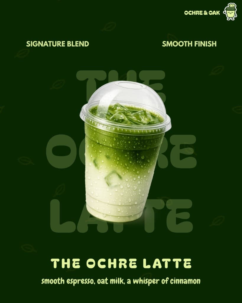
Featured drink post for the Ochre Latte. A clean, condensation-beaded product shot kept product-forward, with the mascot tucked quietly into the corner.
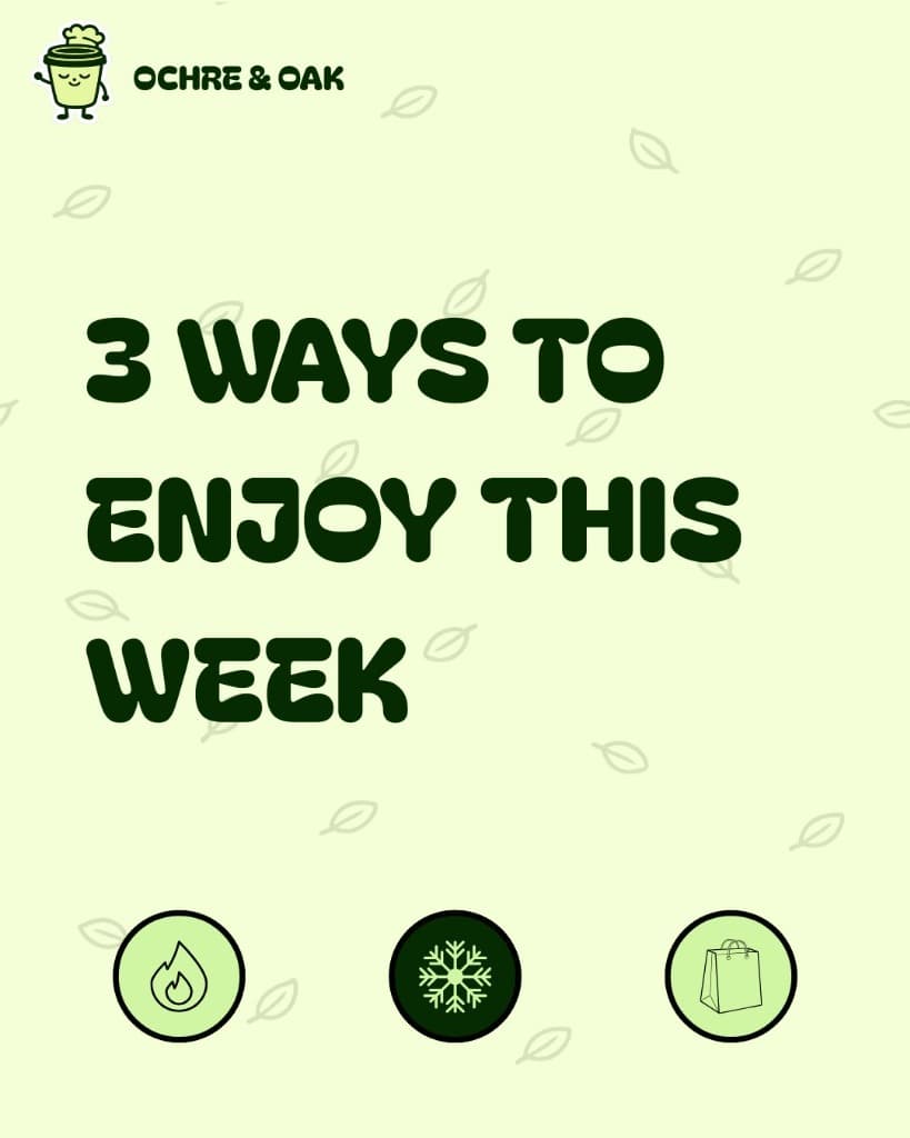
A 'ways to enjoy your coffee' carousel using the same badge-and-caption template as Day 2, so the two carousels read as siblings.
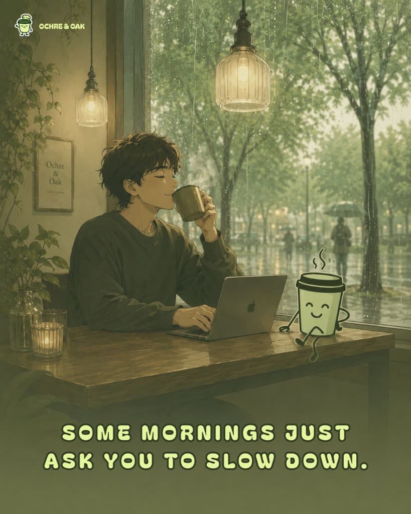
A moody, illustrated café-window scene with a miniature mascot seated at the table — turning a cozy stock mood into a scene that's unmistakably Ochre & Oak.
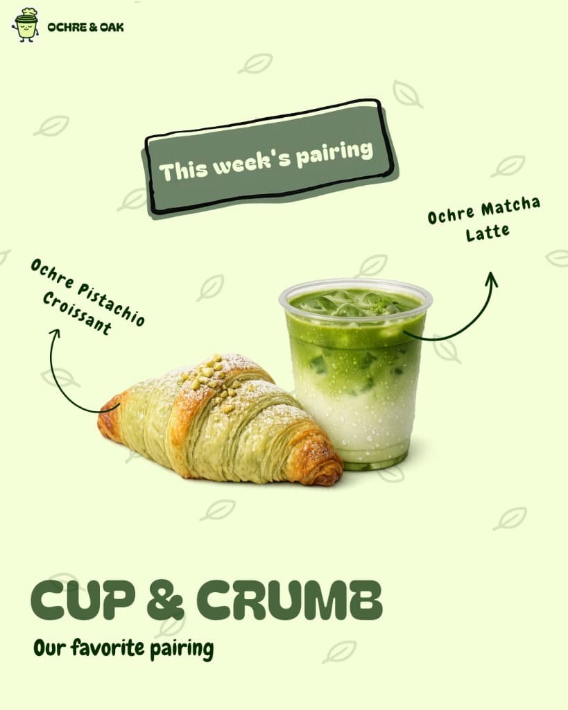
A pairing post for coffee and pastry, styled as a flat lay with hand-drawn callouts — appetite appeal handled through product photography rather than heavy graphic styling.
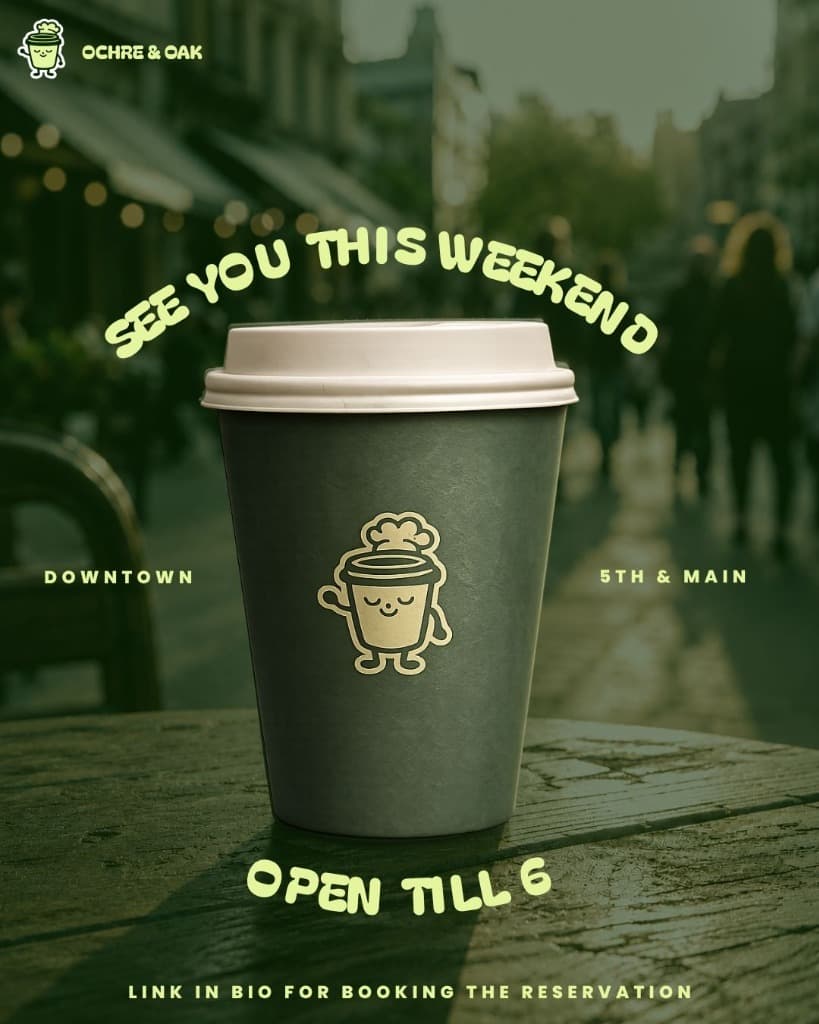
Weekend CTA post featuring a real to-go cup branded with the mascot as a foil sticker — the one post where the mascot moves off the screen and onto the physical product.
The Mascot
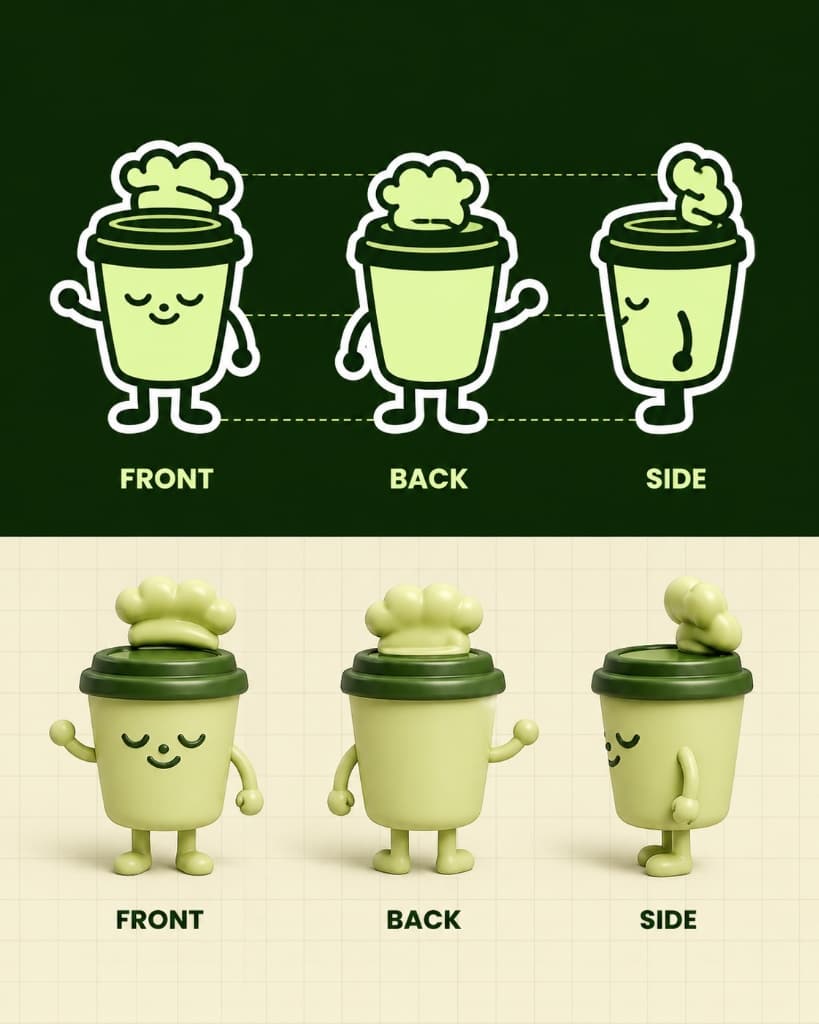
A small anthropomorphic coffee cup — light sage-green body, dark forest-green rim and lid, closed sleepy eyes, a gentle smile, and a soft cream foam swirl styled like a little chef's hat. Simple stick arms and legs give it just enough personality to wave, walk, or sit at a table without ever feeling over-designed.
What makes it work as a system, not just a logo: it appears as a full illustrated hero on Day 1, shrinks to a quiet corner badge on product and process posts (Days 2–6), and shows up 'in the wild' as a printed sticker on a real cup in Day 7 — moving between flat graphic design, editorial illustration, and photographed product without ever breaking character. That consistency is what lets seven visually different posts read instantly as the same brand while scrolling.
Design Rationale
| Brief requirement | How it was addressed |
|---|---|
| "Minimal, slow-morning café feeling" | Breathable layouts, generous negative space, unhurried rounded typography, and soft taglines across every post |
| "Consistent brand across 7 different formats" | A single recurring mascot appears in every post — full hero, corner badge, illustrated companion, or physical cup sticker |
| "Bean-to-cup" and "ways to enjoy" carousels | Matching step templates (circular badge, step tag, headline, caption) so each carousel reads as a structured swipe-through |
| "Moody, cozy" behind-the-scenes post | Illustrated rainy café-window scene with the mascot seated at the table, pairing warmth with narrative |
| "Appetite-appeal" pairing post | Flat-lay-adjacent photography with hand-labeled callouts, keeping focus on the food and drink |
| "Bold, inviting" weekend CTA | Wavy display type, a physical to-go cup carrying the mascot as a sticker, clear location and hours |
Project Outcome
The result is a seven-day feed that never repeats the same post twice — moving between illustration, product photography, icon-driven carousels, and outdoor lifestyle shots — yet reads as one unmistakable brand throughout, carried almost entirely by a single, well-designed mascot.