Veyra — Skincare Brand & Social Media Content Design
Fictional Client Project · Beauty & Skincare / Personal Care · 7-Day Social Media Content Series
Veyra is a clean, minimal skincare brand positioned as 'quiet luxury' — calm, trustworthy, and slightly clinical but soft. This project covers a full 7-day Instagram content calendar built entirely on restraint: a locked type system, a disciplined two-tone palette, and one flexible logo mark carrying identity across statement cards, photography, and typographic posts.
How the content measures up against the brief
*Subjective self-assessment scores (1–10 scale) against key creative brief parameters.
The Brief
Veyra is a clean, minimal skincare brand positioned as 'quiet luxury' rather than trendy K-beauty — calm, trustworthy, and slightly clinical but soft. Aimed at women 20–35 who want simple, effective skincare without a twelve-step routine. The brief called for a soft white / sage / dusty blush palette, editorial sans-serif typography with generous tracking, and photography built on soft shadows, glass/ceramic textures, and high negative space — avoiding clutter entirely, with one hero element per slide.
The ask covered seven distinct days: a brand-intro post, a benefit/ingredient-substance post, a ritual/lifestyle moment, a brand-philosophy statement, a formula/trust post, a launch invitation, and a closing testimonial — each doing a different job in the arc from 'who is this brand' to 'why should you buy it,' while all needing to read as one unmistakable identity.
The Challenge
A 7-day calendar built almost entirely on restraint is harder to hold together than one built on a mascot or a bold color explosion — there's nowhere to hide inconsistency. The challenge was making a solid-color statement card, a photographic lifestyle shot, a typographic ingredient list, and a centered product post all feel like the same quiet brand, without ever leaning on clutter, badges, or decoration to do the job.
Rather than relying on a character or an ornamental system, the project used three quieter tools as glue: a single locked type pairing (Josefin Sans for tracked-out headlines, Poppins Light for supporting copy), a two-color palette used in deliberate rhythm (soft cream and sage green alternating across the week, so the grid breathes rather than repeats), and one consistent logo placement logic — small, corner-anchored on product posts, recolored and bottom-centered like a signature on the two pure-statement posts.
The 7-Day Content Grid
Click any card to expand in Lightbox · Single-image posts
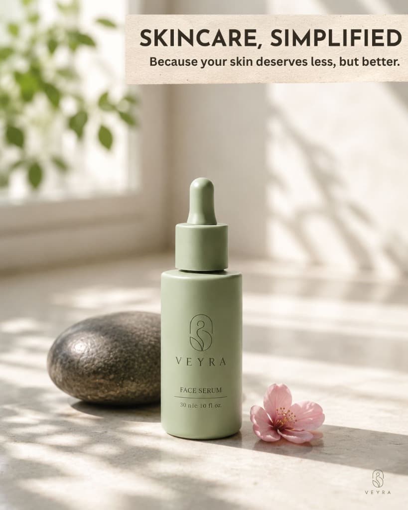
Brand intro post — the product centered on soft cream with generous negative space, letting the headline 'Skincare, Simplified' and the product carry the entire first impression.
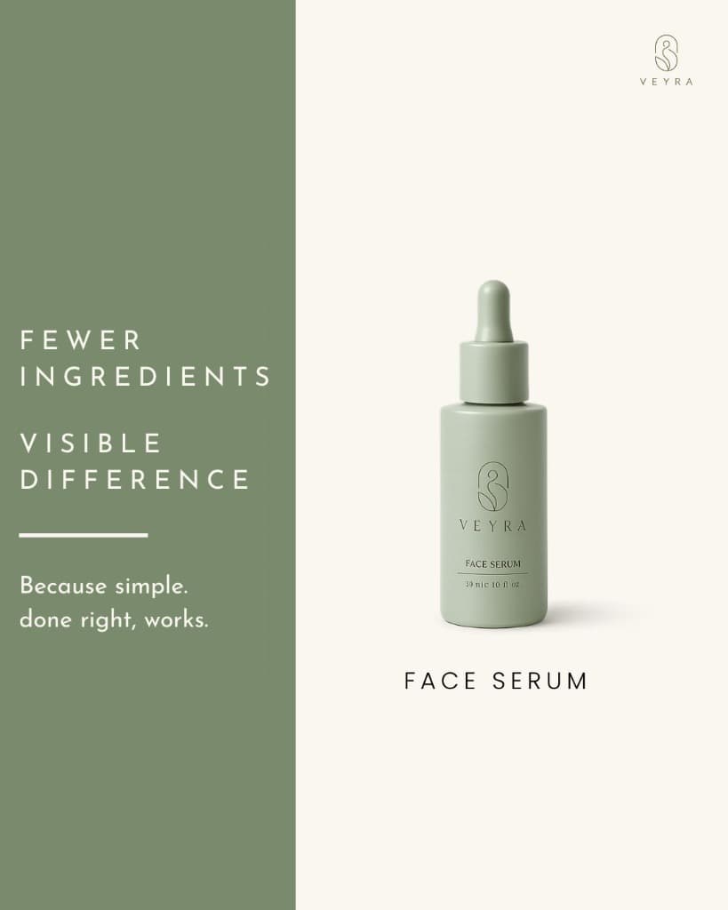
A hard color-block ad-style split introducing the product's conviction: 'Fewer Ingredients. Visible Difference.' against a bold sage panel.
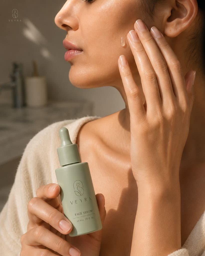
An intimate, quiet photographic ritual moment — no headline text, letting the image and caption carry the story instead of an overlay.
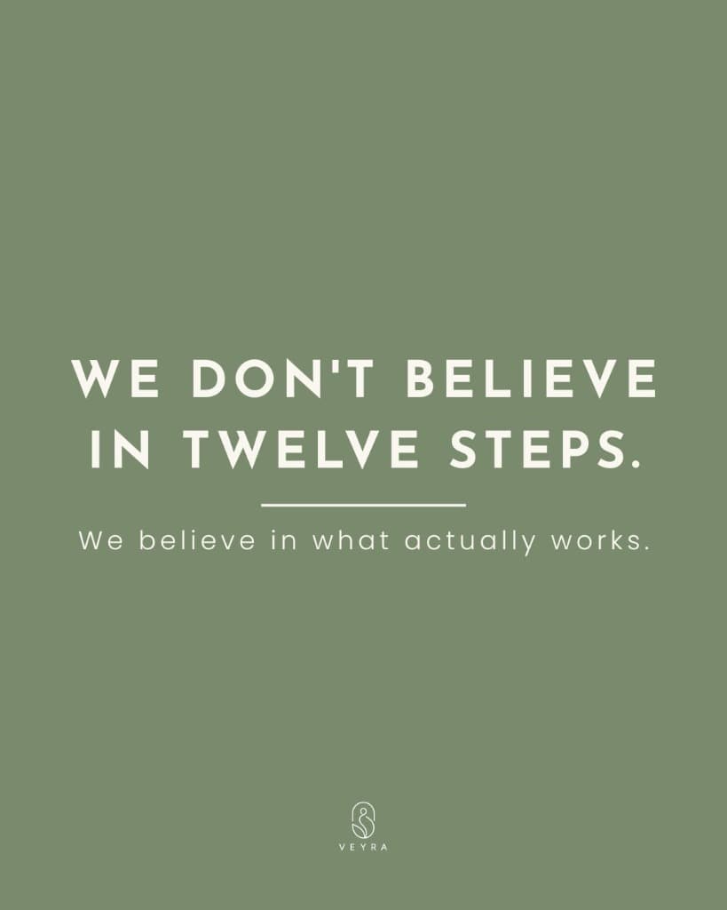
A solid sage philosophy card, type-only: 'We don't believe in twelve steps.' The one day the brand speaks without showing product at all.
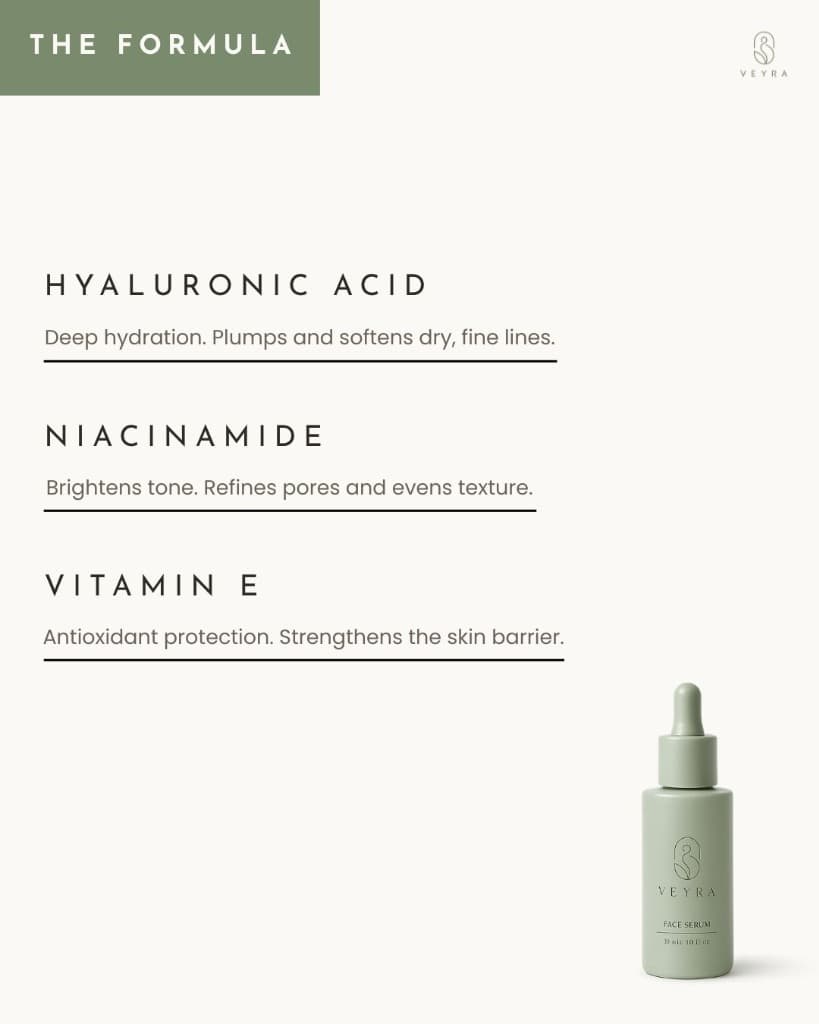
A left-aligned typographic ingredient breakdown — Hyaluronic Acid, Niacinamide, Vitamin E — anchored by a small bottle bottom-right for trust-building.
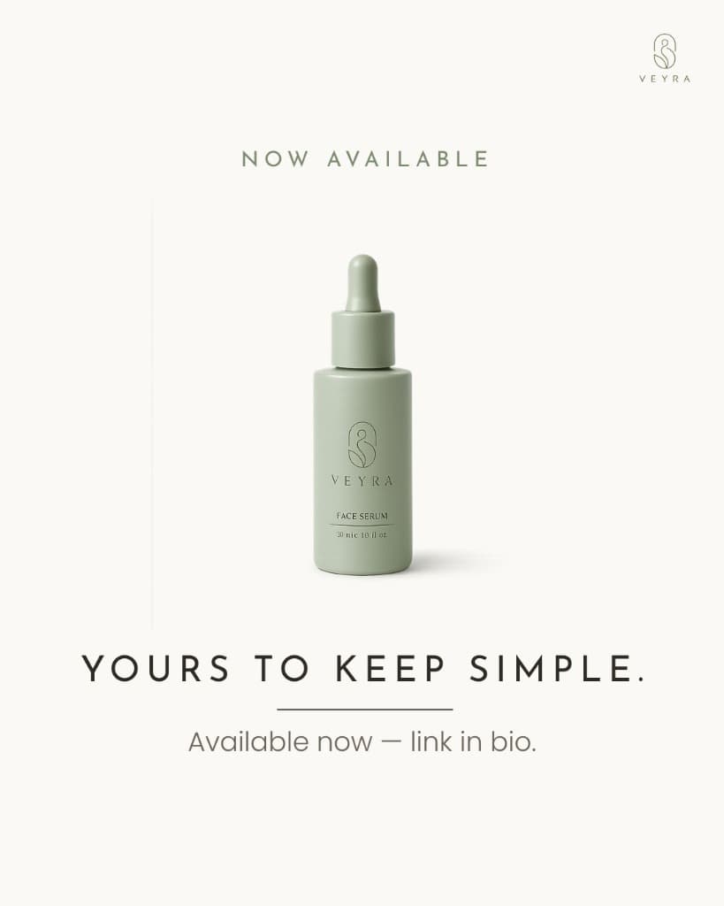
A deliberate visual echo of Day 1, but shifting from introduction to invitation with 'Yours to Keep Simple' and a quiet launch CTA.
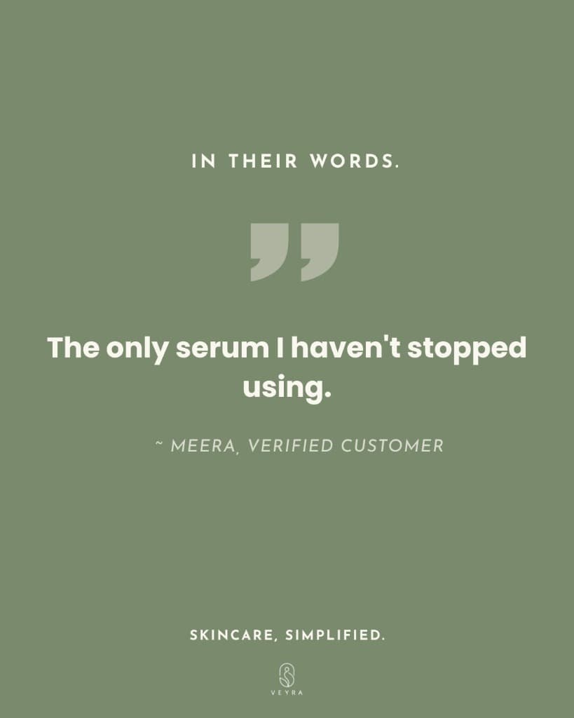
A closing testimonial card pairing a customer quote with the campaign's opening tagline, closing the loop from introduction to proof.
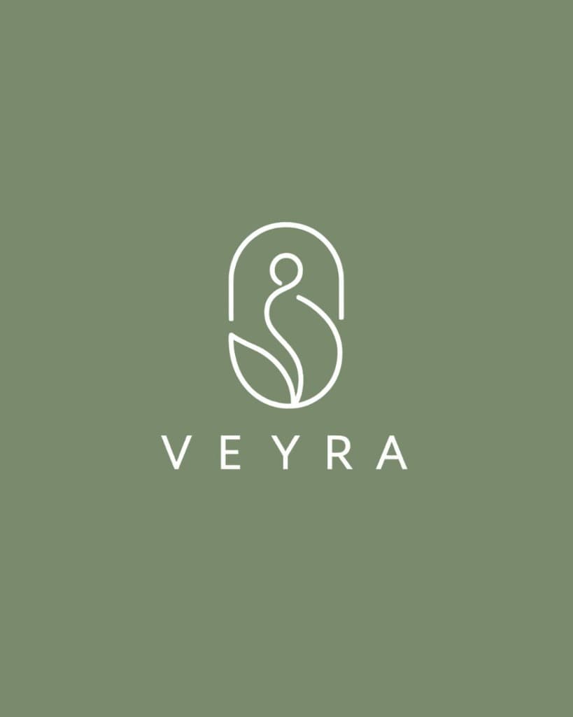
The Logo
A single abstract, line-drawn emblem that reads as a softly rounded figure-and-leaf silhouette rather than a literal object: an open, arched outline containing a looped, almost figure-like line that resolves into a small leaf shape at its base. Rendered in a single sage-green line weight with no fill, shading, or gradient, it sits above the tracked-caps wordmark 'VEYRA' set in a clean, airy sans-serif.
What makes it work as a system rather than a decoration is its restraint and flexibility: it appears at full size embossed directly onto the product bottle, shrinks to a quiet corner mark on every graphic post, and is the only element in the entire system ever recolored — swapped from its native sage to cream on the two solid-color statement cards (Days 4 and 7) — so it can sit correctly against either half of the brand's two-tone palette without ever needing a second version designed.
Design Rationale
| Brief requirement | How it was addressed |
|---|---|
| "Quiet luxury, not trendy K-beauty" | Restrained one-hero-element compositions, generous negative space, and tracked editorial type on every post, with no icons, badges, or claims stickers |
| "Consistent brand across 7 different formats" | One locked type pairing and one two-tone palette used in deliberate rhythm, plus a single consistent logo placement logic |
| "Calm, trustworthy, slightly clinical but soft" | The ingredient post (Day 5) and philosophy post (Day 4) build credibility through plain, unembellished statements |
| "High negative space, minimal props" | Days 1, 2, 5, and 6 keep the product small in frame with deliberate empty space; Day 3 uses a tight, quiet crop rather than a styled scene |
| "Ritual, lifestyle moment without breaking restraint" | Day 3 implies routine and intimacy through framing rather than props or overlay text |
| "A confident close to the week" | Day 7 pairs a customer's voice with the campaign's opening tagline, closing the arc in a single quiet card |
Project Outcome
The result is a seven-day feed that moves between solid-color statement cards, close intimate photography, and typographic ingredient breakdowns without ever repeating the same layout twice — yet reads as one unmistakably quiet, confident brand throughout, carried almost entirely by a single locked type system, a disciplined two-tone palette, and one flexible logo mark doing double duty as both a corner signature and, twice, the closing word.